MY ROLE
Holistic design ownership
End-to-end product launches
Player/coach leadership
TEAM
Scott, design lead
Fabio, design
Charles, product
Marc, engineering
Sandra, marketing
Katie, content
TIMELINE
8 weeks for 0-1 launch, then 16 weeks of additional product enhancement
RESULT
Successful product launch
Lifted revenue and retention
Positive health impact
📖 7 minute read
Summary
I led the transformation of this unique healthcare startup from a tranquil mental wellness brand into an energetic, effective experience that shaped positive outcomes for thousands of young people.
Mental health in Minecraft
When I joined Hero Journey Club, they had established a successful, innovative adult mental wellness program that combined group online gaming with professional therapeutic guidance. I was brought on to help the company launch the youth-focused version of that program.
The Hero Journey Club model is novel, but simple: small groups gather each week in an audio-only online space, facilitated by a mental health professional, to play a video game together and talk about life.
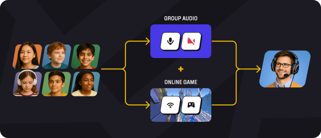
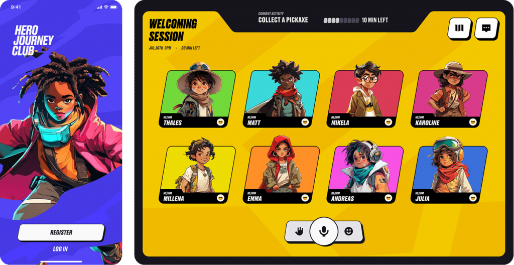
Groups of similar-age kids play, talk, and learn online with a trained educator
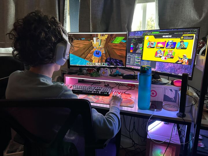
A teen playing Minecraft in a private audio chat with his Hero Journey Club group
Roadmap
I worked closely with the founding team to define the specific stages necessary for the redesign and launch of the program into the youth space:
1
Expand new product vision into a robust design system
Translate agency work into functional libraries and components
2
Rework end-to-end experience for a dual audience
Develop improvements to existing UX and apply new design language across entire product
3
Prepare to pivot post-launch as needed
Be ready to rapidly shift focus to acquisition and onboarding needs
4
Design and launch critical fast follows
Conduct ongoing user testing to identify and develop high-value enhancements
5
Improve retention and LTV
Particularly through the exploration and implementation of AI-assisted personalization
1. Developing the new design system
The two-buyer problem
As the company began adapting its experience for a younger audience, we began preparing to answer the big question: how do you make a product engaging for children, but effective enough to sell the parent? The kids want their experience to be enjoyable; their guardians want it to clinically rigorous. As soon as we mention video games, parents frequently become skeptical.
PARENTS
Buy-in requires high trust and a clear promise of efficacy. Often operating in an elevated mode of stress as they adjust to raising a child with mental health needs.
CHILDREN
Buy-in requires excitement and autonomy. Often operating in a distracted, emotionally distressed state as they explore issues such as depression, anxiety, and neurodivergence.
Ultimately, there’s no real “answer” to the two-buyer problem: you simply design maximal satisfaction for both audiences at each and every step of their respective user journey.
Reimagining the brand
When I joined, the company had already built a remarkable platform for engaging adults. The existing design system was well calibrated for this audience: thoughtful, understated, with soft primary hues and warm negative space, relying on familiar, mature design patterns.
It also tested terribly with 8-17 year olds, who found it too boring, clinical, and school-like. We needed a new visual approach to serve young people effectively and authentically, while also earning the trust of parents.
The existing adult-focused visual language, known internally as the “Green” design
Look & feel level up
As I joined, Hero Journey Club had been working with the highly-reputable design agency Metalab to assist in the creation of that new vision. Through an intensive exploration process, the designers at Metalab delivered a compelling vision for the future of the brand: a vibrant, game-inspired visual language that could stand comfortably alongside relevant gaming experiences such as Fortnite, Valorant, and GTA5.
More than a simple reskin, this was a foundational rebuild of the service into something genuinely engaging for our new audience. With this new aspiration as a compass, it was up to me to translate Metalab’s mockups and UI kit into a functional, scalable design system, then work with our design & engineering teams to apply it across the end-to-end experience.
Sample of brand/UI explorations from Metalab
A combined identity for a divided audience
However, user testing promptly revealed a critical issue with the new design language. Kids loved the bright, game-like interface, responding well to the imaginative visuals and futuristic typography. Parents, on the other hand, found it garish. “Too loud and comic book-y,” “not appropriate for mental health,” interviewees remarked. The design system had neglected that parents—the buyers in our equation—are looking for help: care, safety, and efficacy.
Considering this feedback, I adopted “sincerity” as a better-aligned anchor value for our parent audience. After consulting with my design team, I created an offshoot parent sub-brand, which was then integrated into our new multi-part design system: Core, Youth, and Adult. This family of identities would compliment each other, lending flexibility in tone and fit for the audience.
We named this dual identity HeroPunk.
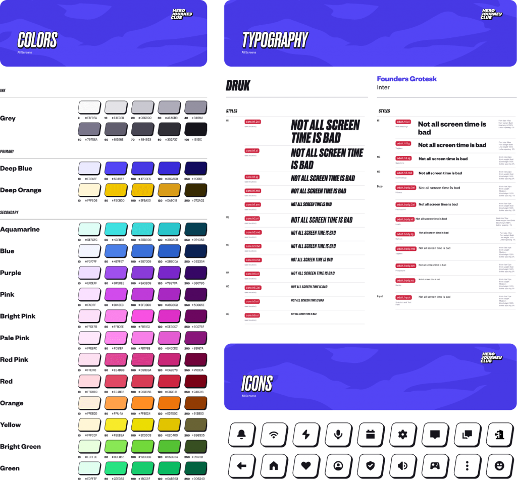
HeroPunk Core – the foundation
Establishes consistent colors, fonts, and icons
HeroPunk Youth – excitement, autonomy
Adds bold typography, extruded shapes, and vibrant game-like imagery
HeroPunk Adult – sincerity, trust
Balances with soft colors, simple typography, and clear design patterns
2. Launching the core experience
Concurrent UX enhancements
To prepare an effective implementation of the new design system, I also quickly conducted a UX audit of all current screens, flows, and processes, then created a service blueprint to provide a clear visual reference for product enhancement discussions within the team. Through team observations, user interviews, and a healthy dose of dogfooding, we identified four critical opportunities:
TIME ON TASK
Users were being led through a lengthy acquisition flow without clear progress indicators, producing high completion times and suppressing conversion rate.
VERIFICATION
Users were being asked to provide their SSN to a third party during onboarding without enough trust or context, leading to a significant dropoff at this step.
GAME SETUP
Users were not being given enough information to complete this step on their own, prompting a high volume of support calls.
AUDIO
Users were frequently experiencing issues with being able to hear and be heard during audio sessions, lowering satisfaction and retention.
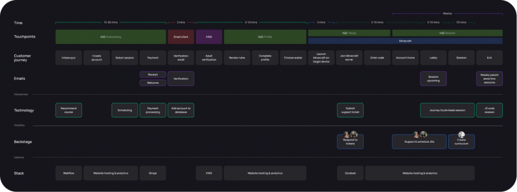
Service blueprint for identifying weak points in current UX
Acting as a player/coach, I coordinated with my junior associate to parallel-path the reskin and UX enhancements. To start, I leaned on the strength of their technical experience in Figma to build out the component libraries for the E2E reskin, while I took a harder look at the acquisition flow and audio issues. I also worked closely with our CTO and Head of Product to rework the verification experience, ultimately opting to drop the external solution and embed a more natural Stripe-powered, credit-card based approach to the checkout flow.
As the component libraries neared completion, I also handed off the game setup experience to my associate for further development. I offered initial explorations and guidance, then continued to provide feedback and suggest adjustments as this flow expanded to cover a wide range of gaming platforms, learnability levels, and rescue states.
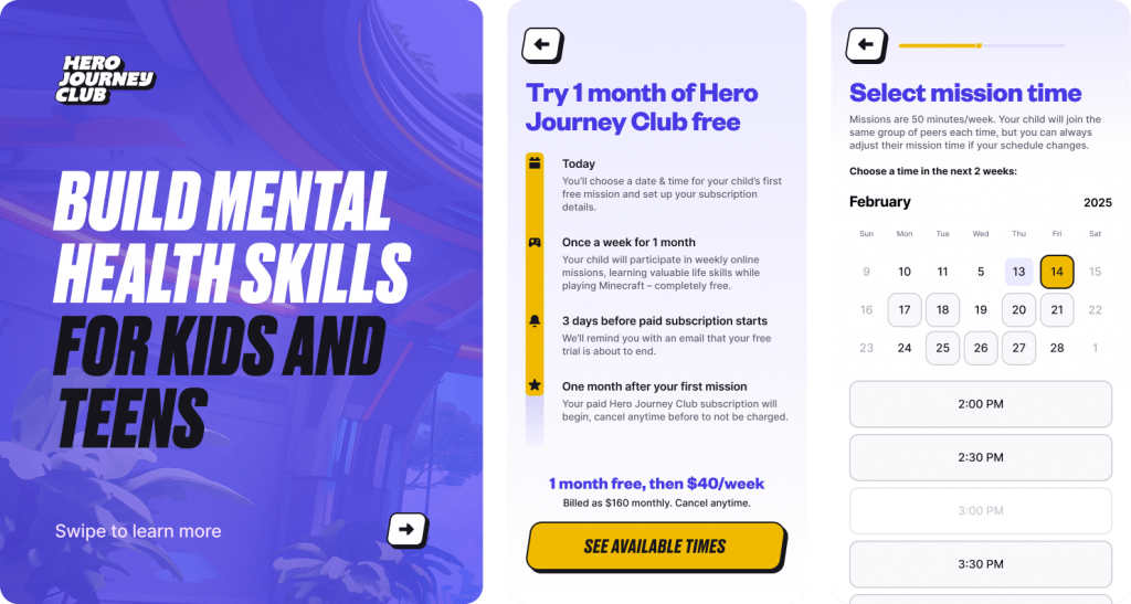
Implementing the new end-to-end design system
With UX adjustments in place and the new design system ready to deploy, the entire team was reorganized around an aggressive launch window. In addition to managing all aspects of the 6-week design implementation across product, engineering, marketing, and content, I also reworked our spec delivery standards and templating, produced a comprehensive brand guide and asset collection, and developed guidelines for creating engaging, relatable avatar characters for youth users to choose from.
Here are excerpt screens from the full redesign of the youth program launch:
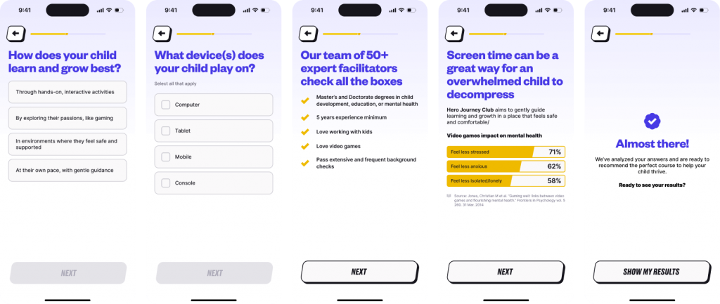
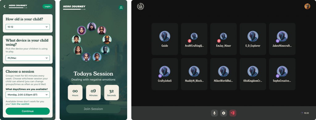
Acquisition quiz flow, including new progress bar
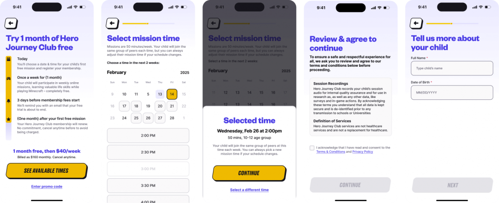
Onboarding flow, including new free trial explanation screen
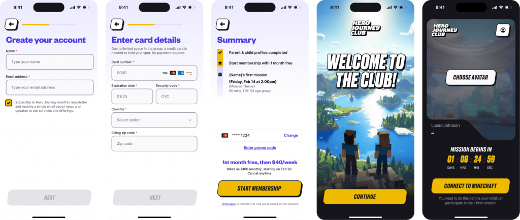
Checkout flow, including new Stripe verification tool
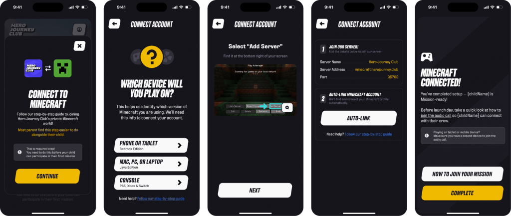
Game setup screens, with step-by-step instructions
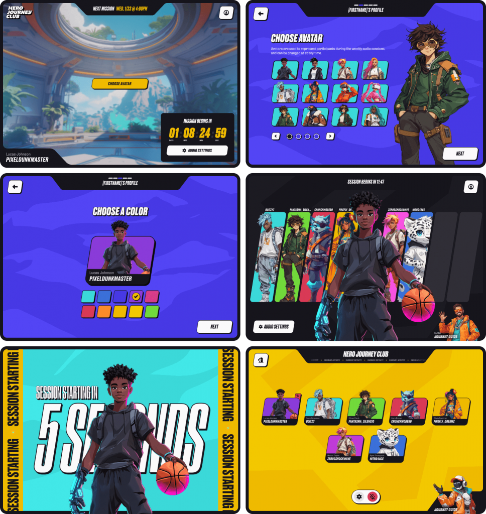
Youth avatar selection & audio experience
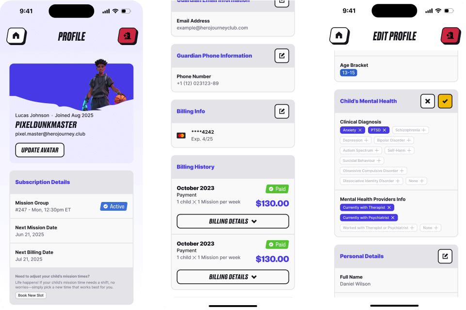
Parent profile, billing, and account management
Creating relatability & resonance
Through game design considerations and user feedback, we determined that having a library of engaging avatars to choose from would help our kids & teens feel a stronger sense of identity and connection during the sessions, leading to more powerful, lasting mental health outcomes. Metalab’s explorations prescribed a vibrant world of bold colors, game-like interfaces, and engaging, relatable characters.
Character development
To accomplish this somewhat radical departure from more standard UI design approaches, I worked closely with the CEO and product team to identify and develop a set of characters that kids would find highly relatable and engaging. We structured this process through the creation of a character ideation matrix, based on a set of “archetypes” and “forms.”
ARCHETYPES
Explorer
Curious and adventurous, always seeking new experiences and knowledge, driven by a deep desire to discover the unknown
Healer
Compassionate and empathetic, dedicated to supporting and restoring the wellbeing of others, both emotionally and physically
Techie
Innovative and analytical, experts in navigating and utilizing technology to solve problems and enhance capabilities
Creative
Imaginative and expressive, constantly crafting original ideas and bringing unique perspectives to life in artistic forms
FORMS
Human
Aspirational view of a future state, embodying confidence and a growth mindset
Animal
Metaphysical connection to an inner self-perception, capturing strong personality traits
Mythical
Being open to the unknown, mapping imagined states on to actionable behavior
Inanimate
Empathetic imbuement of the unexpected, finding inspiration in underlying natures
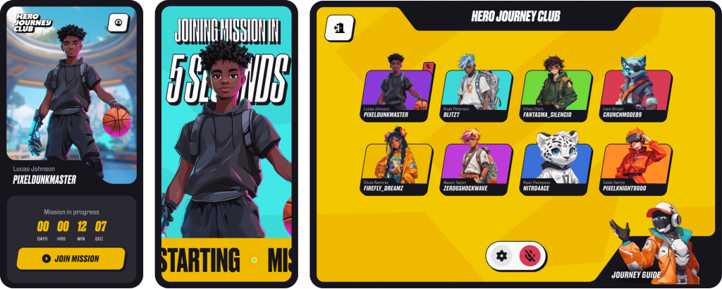
Avatars & artwork
Using this character ideation matrix, I created a collection of placeholder avatars that would appeal to 8-17 year olds. I also developed internal guidance for the exploratory use of AI-generated imagery, then took the initiative to source and direct professional artists in the creation of final production assets.
I created a set of prototype avatars based on our character ideation matrix
“To accelerate the launch of the Youth 1.0 program, we will use AI-generated avatar images as temporary placeholders. These images will be used to test and iterate what styles and stories resonate with users, then we will hire talented in-house or freelance illustrators to produce final artwork. This process will help us continue to craft a world-class experience for our members.
AI image generation is built on the work of thousands of talented professional artists who neither consented to nor were compensated for the inclusion of their work in training data – as such, we are committed to find the optimal way for HJC to engage, respect, and support this community of artists.”
– My internal memo on the use of AI image generation
Sourcing and direction of artists for the production of final assets
Launched on time, in record time
The full end-to-end redesign of the youth program was launched in 8 weeks, just over 2 months from my initial hire date.
3. Post-launch acquisition pivot
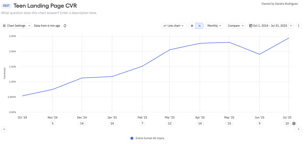
Following the launch, our acquisition data showed strong engagement, but still considerable friction in the conversion experience. I immediately shifted focus to support our marketing director in the refinement of our acquisition approach. We worked side-by-side to relentlessly iterate and test the primary acquisition quiz flow, resulting in the launch of multiple critical enhancements.
Based on our learnings, I also heavily influenced a movement away from our current “free trial with credit card” model and into a “guest membership” model. This included adjustments to pricing packages, onboarding flows, and organic growth messaging to embrace low-commitment entry points. The push was controversial, but added to a significant lift in conversion rate and laid the groundwork for unlocking future growth through peer-to-peer referrals.
4. Other critical enhancements
“Hold my spot”
Through post-launch testing, we discovered an urgent, unexpected opportunity: despite the offer a of a free trial, many parents were hesitating to sign up for the program without first talking about it with their child.
And with their children often at school or otherwise unavailable, this was a significant blocker for conversions. We were losing warm leads – so, through a variety of explorations, I came up with an unconventional proposal: what if we simply built this moment directly into the experience?
This thought was launched 2 weeks later as the “Hold My Spot” feature:
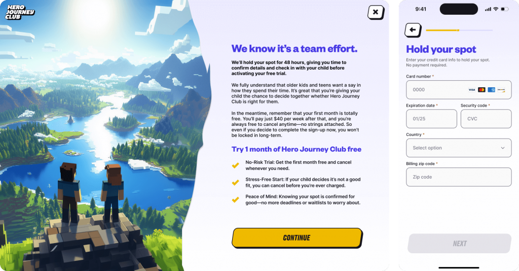
The Hold My Spot intervention flow, offered during checkout
This new intervention flow was extremely well received, with parents commenting that it “made them feel seen” and was “unexpectedly considerate.” User interviews showed significantly higher trust scores, and the feature resulted in a measurable impact to CVR.
Internal admin tool
As the new service began to grow, we found another urgent opportunity: managing hundreds of weekly sessions began to require tremendous internal and external coordination, causing undue stress to support operations. Our nascent internal admin tool needed a robust expansion of automation capabilities to replace what had previously been happening across spreadsheets, phone calls, and emails.
For this project, I assumed a mentorship role, giving my junior associate full ownership. I provided feedback and support while they led customer success and engineering in the design and launch of a new, comprehensive (and delightfully easy-to-use) internal customer and session management portal.
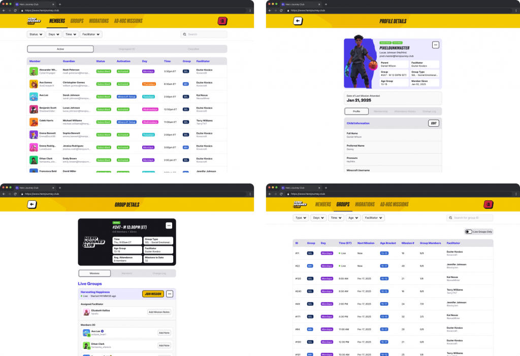
Oversaw creation of the internal admin tool.
5. Personalization through AI-driven insights
Maya, our companion bot
With hundreds of “journey groups” being added weekly, we conducted ongoing interviews with parents to evaluate satisfaction, listen for feature requests, and make plans to improve LTV. One theme quickly rose to the top: parents wanted more insight relating to their child’s progress.
I helped the team recognize this as an opportunity for the appropriate and effective use of LLM tech to enhance the parent experience, helping users feel more informed and connected to their child’s progress. I then designed and launched Maya, our carefully tuned chatbot, which was empowered to provide private, child-specific insights and give personalized answers to questions about our program, emotional management strategies, and other teen mental health support information.
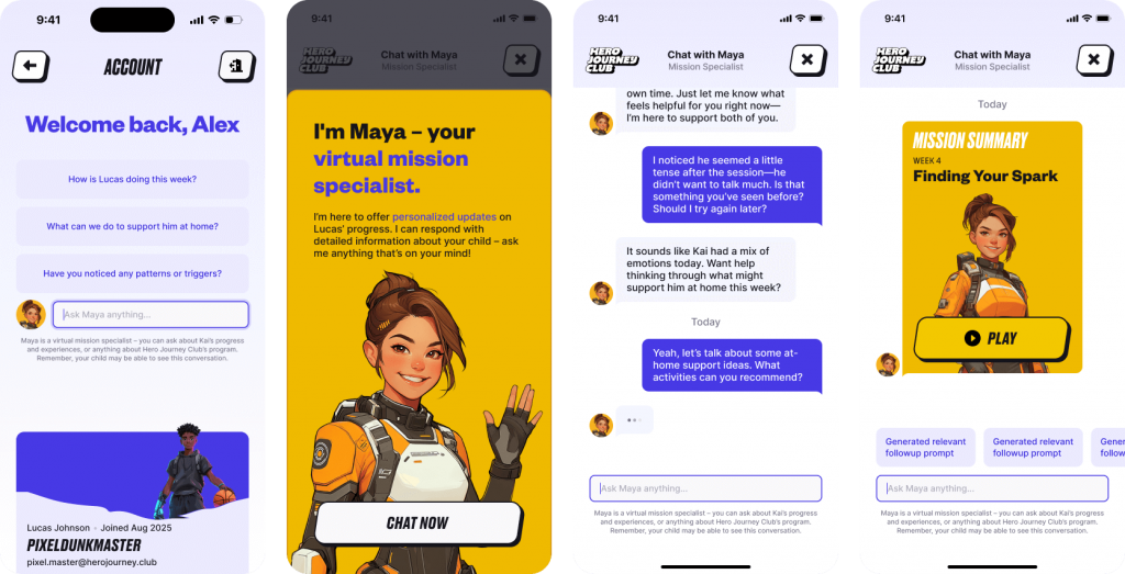
Excerpts from the parent support chatbot feature.
Mission Summary
To compliment Maya’s offerings as a useful companion, I also developed, designed, and launched a new weekly “Mission Summary” experience. Closely resembling other UX entries in the style of Spotify Wrapped, the Mission Summary included key information about the weekly gameplay sessions, along with personalized, uplifting messages about their child’s progress.
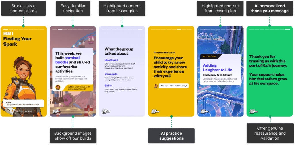
Parent-focused Mission Summary experience
I also worked with our game designer to gain access to our private, custom Minecraft worlds the kids were experiencing each week, so I could capture beautiful preview images and help bring parents further into this often-unfamiliar world of mental health and gaming.
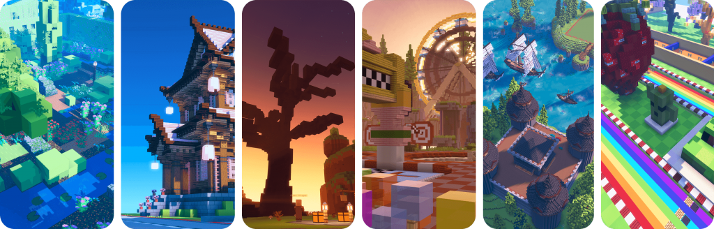
Backgrounds I captured in-game for Mission Summary screens
Results
Leveled up design
I transformed design at Hero Journey Club from a mix of freelancers and outside agencies into a world-class internal team with effective cross-functional relationships, above-industry-standard practices, and a clear vision for the importance and urgency of the work we were contributing to.
Enabled and accelerated growth
The redesign, launch, and refinement of the youth program lead to over 3x improvement in conversion rate, gaining 4,000+ active users in less than 10 months.
The youth program officially launched in Nov ’24.
Lifelong positive impact on health
However, the most important outcomes for the new program could be found in messages from parents describing their child’s improved emotional skills and social confidence. Hero Journey Club helped thousands of vulnerable kids during a critical development window, giving them access to mentorship and community that most wouldn’t have found otherwise.
“Hero Journey Club has helped my son tremendously. He is making friends at school, his confidence has skyrocketed, he’s getting better grades, he’s working harder on his relationships with his siblings, he’s showing more respect and appreciation for his parents, and he’s made friends from different parts of the world. I’ll forever be grateful for finding this program and getting him into a great group. He is still in the Club and looks forward to his mission every week.“
– Lori, mom of a 12 year old
“We had parent-teacher conferences yesterday, and my child’s teacher commented that their ability to resolve conflicts and set boundaries with peers has improved significantly this year. She still needs an adult to help debrief, but she’s attempting to resolve issues on her own before coming to the adult. I’m also seeing improvements in her patience with his brother – there’s a noticeable increase of impulse control as well as conflict resolution skills.“
– Elizabeth, mom of a 9 year old
“‘You are not broken and you are not alone, you are just working on your own journey’ – these words of yours profoundly impacted my family. Your approach to making mental health support accessible and deeply human reflects exactly what healthcare should be.”
– Mareshah, mom of a 15 year old
Sample of mobile designs.